The Most Entertaining Guide to Landing Page Optimization You’ll Ever Read

Posted by OliGardner

Landing pages rule. Blah.
Homepages suck. Blah.
Do some A/B testing. Blah.
Base your optimization strategy on customer feedback. Blah.
All of those statements are true. But they sound boring and being boring is lame. It’s twenty fourteen and I refuse to be lame.
If you want to be a non-lame marketer, it’s really easy. Read this post, have a laugh, and treat everything I say as gospel.
Be warned, however, that I may descend into telling bad jokes in the absence of witty metaphor and charming anecdotal rhetoric.
The experienced adult readers amongst you might remember that “Shit. The condom broke!” moment. Yeah you do. You might also remember that it felt like a good time to run a test. #STDsArentFunny. Perhaps. But, as we go through this epic journey together today, I’ll show you exactly when and how you should really be testing.

But first. The best 7-part list of bullet points you’ll ever read.
The start of the best part of your day begins now with this table of contents:
- First I’ll give you the only rationale you’ll ever need to explain why landing pages are to marketers, what Immodium is to an astronaut with diarrhea. Essential.
- I’ll prove why context – not content – is king when it comes to conversion.
- Following that, I will make you fall in love with forms. FYI, it’s really, really hard to make form love a “thing”.
- Mid way through we’ll sip some Canadian Club, get our Don Draper on, and learn how to write copy like the Mad Men (and Women).
- “Paint me a pretty picture Johnny!” “Screw you mommy. Design is not just rainbows and unicorns!”
- Is it greedy to want a second helping when you’re an orphan? Not if you have my name. (It’s Oliver in case you’re confused). Always ask for more when it comes to conversion .
- And finally, I’ll put my art critic hat on and rip into some landing page examples, both good and bad.
Challenge laid down. Challenge accepted (on your behalf).
Chapter 1: Why landing pages rule, and why you should never send campaign traffic to your homepage
If I’ve got your attention thus far, it’s probably because you can’t bear to tear your eyes away from my enchanting prose.
The only important word in that sentence is ATTENTION.
Attention is a state of mind that you can’t assume your visitors will even enter if you don’t give them the right conversion experience.
A good conversion experience is one in which your visitors are compelled to pay attention and ultimately interact with your conversion goal – clicking the Call-To-Action (CTA).
A bad conversion experience is one in which your visitor is compelled to run away.
There are three sides to attention that we need to consider:
-
Capturing your visitor’s attention
-
Maintaining your visitor’s attention
-
Focusing your visitor’s attention
Your ad covers point #1, and landing pages are the answer to solve numbers 2 and 3, so let’s start with number 2.
Genius Insight #1: attention ratio
Pay attention as I set the scene.

Let’s say you’re running a marketing campaign for a promotion:
“50% off Miley Cyrus Twerkout* DVDs”
* I’m claiming a ™ on that brilliant piece of branding.
Got your attention, right?
Well, let’s see. What is attention ratio?

With that in mind, consider the two diagrams below. The first is a typical homepage, and the second is a campaign specific landing page.

The Homepage
On this homepage, your Twerkout campaign is represented by “promo 2” highlighted by the red circle.
The rest of the page is comprised of a few other Miley promotions, some tour dates, navigation, a general brand proposition about how Hanna Montana is no longer a thing, a photo slider, footer navigation and many other page “leaks”.
If you send people to your homepage – from a paid ad, email or social media – the intended campaign conversion goal has to fight to get their attention with all of the other interactive elements on the page.
A typical homepage has approximately 40 links.
In the example opposite there is actually a total of 56 links, therefore:
The attention ratio is 56:1
#puke
Hey, don’t just take my word for it. This overstimulus has impacted many other people’s lives according to Princeton University wuuut!
Princeton neuroscientists found out the more stuff you have around you, the more each piece of stimulation competes for “neural representation”–that is, your attention.
Back to our scientific marketing experiment. Let’s now consider the Twerkout promotion on a dedicated, campaign-specific landing page.

The Landing Page
On a campaign-specific landing page, the entire page is focused on only one thing, the Twerkout DVD campaign.
The messaging is very tightly related to the campaign goal and has only 1 interactive element – the CTA.
The attention ratio is 1:1
#slapmyassandcallmemileythatsgood
Let’s look at an example of someone doing this right. Salesforce is a company with an incredibly complex product offering. Their website is a cacophony of possible pathways.

If you dig deep into the site, their primary goal seems to be to get you signed up for a product demo. Not surprising given the complexity of their software.
So what happens when you search for Salesforce in Google? The first organic result will take you to the homepage. But the first paid ad (right at the top of the page) takes you to a different page entirely. Presumable because you typed in their name and are showing a level of prior knowledge.
The page you arrive at looks like this:

It’s a great landing page. Entirely focused on a single goal. To get you to watch a demo of any of their products. The headline and CTA could use a bit more mention of the purpose of the page (watching a demo). Also, take a look at the button. It’s the same colour as the form container. DON’T DO THAT! Use some contrast Salesforce.
Aside from those things, it’s a really nicely designed, focused experience.
One last example. Where would you look/click in this situation?

How about now?

Got it? Never feed your marketing traffic to a peacock, unless you’ve poked his eyes out.
The feather ones, not his actual eyeballs! Wow, you’re sick.
Genius Insight #2: conversion coupling
You are now 50% of the way to being smarter than 98% of all marketers.

Synergy. That’s what I’m talking about. Uck. What a gross word.
Here’s the second piece of most of almost everything you need to know to be the cleverest person in the room at any marketing conference. Try saying that fast.

In more detail it’s comprised of one or more of the following:
-
Message match: Matching the copy of your ad to the headline of your landing page.
-
Design match: Matching the design of your display ad to the design on your landing page.
Let’s look at the good and the bad of them.
Message match
To expand, message match is the idea of matching the pre-click message to the post-click message on your landing page, with the goal of making people think they made a “good click”.
The messaging on the page reinforces the reason for their click, reducing/removing confusion.
Here’s an ad for a startup I’ll be working on after Unbounce:

If that link sent you to a homepage, the target headline may look something like this:
Get More Projects Done With Less Management
This may or may not be a good headline for expressing the brand value proposition, but it doesn’t match the ad at all. Result? Bad message match.
The correct headline in this instance would be:
Project Management Software Without Deadlines
Result? It matches the headline of the ad perfectly, and thus it’s great message match. Ding, ding, ding. Got it?
To build really strong message match, use the subhead of your landing page to reiterate the main point of your ad’s description.

This example introduces aspects of a concept called conversation momentum, which I’ll get to in part 2. But basically you can see that the subhead repeats the end of the ad description “Deadlines are dead.” and finishes the sentence like people do when they’re in the gushy part of a relationship “Choose procrastination instead”.
And it rhymes. #doublerainbow
Here are some good and bad examples of message match from the Google
Carrying on the thread, I searched for “Project management software for teams”.
Here’s what I found:


Excellent match for the headline and the form header (Try it Free >> Try Smartsheet For Free).
Let’s do that again:


There’s no message match here. I was expecting “Project Management Software” and I got “DIY Custom Apps For Improving Team Productivity.”
Not to mention the attention ratio, which is a whopping 35:1 not including the 40 links in drop-down menus.
Take a look at the page if we remove all of the distractions:

So much better! The Attention Ratio is 1:1 and it’s much clearer what you’re supposed to do.
And, going back to the ad:
Why shorten “management” to “mgmt” just to throw both Intuit AND Quickbase in there? To me, that’s brand overload. I like to think of paid ads that are not based on a branded search as needing an application of ” Message Before Brand.” Your brand experience will be introduced after they sign up or through the communication of your page copy. Throwing your name in the ad can waste precious space with a name that people might not be familiar with.
Now I say this based on most companies that don’t have a pervasive brand that could benefit from this tactic. If however you are doing TV ads and a lot of other brand exposure work, then this could be a beneficial tactic to catch people’s eye. But I’d rather add 2-3 more value based words in the headline and relegate the brand name to the 2nd or 3rd row of the ad.
Sidenote: I would love to know some results of this level of branding in paid ads if someone has tested it.
I dare you to search for something that is of importance to your life and do a clickathon. The experiences are shockingly shocking.
So that’s message match!
Boom. Insights. You’re so lucky to be reading this. Next.
Design match
This is one of the easiest techniques to master. Take the design on your display (banner) ad and repeat it on your landing page.
Deep breath.
This time I’ll start with the good side of the force. Example courtesy of RBC Canada via Facebook.
The Facebook ad:

The landing page:

Not only is the message match perfect (100% perfect – can perfect be less than 100%?), the design match also kicks ass. That little dude is following you around with his little sign, letting you know he cares.
HOWEVER. Take a look at the landing page in detail, the page does suffer from Attention Ratio deficiencies (7:1) and the CTA is horribly small. If you did a squint test (squint your eyes from a distance and see what stands out on the page) – you’d see the trust seal, not the CTA.
To improve this, the different options for applying for an account could be on the next page after the click has confirmed interest.
And the CTA would be a lot clearer if it was designed to be bigger with a strongly contrasting button color.
Brain break! Go smoke, pee, or text your life partner. I’ll wait ’til you’re back.
Chapter 2: Context is king, queen, emperor, and boss
The more testing I do the more I keep coming back to one central concept. Context. In this section I’ll show you a few examples of context in action.
But first, a couple of definitions with names that I invented. #yourewelcome #payattention.
2.1 Conversation momentum
The purpose of Conversation momentum is to remove the break in communication that can occur when the click is made. If you’re wooing someone in an email or blog post, it makes sense to continue to do so on the landing page.
You wouldn’t invite someone into your house then act like you had never met them would you?
A big portion of this concept is respect. Respecting the click, respecting the time you want your visitor to invest.
Imagine this line is in your email.
“Let me show you how our product/service can help.”
Sometimes a good way to preserve momentum is to express gratitude to your visitor for showing up.
“I’m glad you were interested in learning more about {words that were on the link}.”
Creating a delightful experience humanizes the relationship and shows you care.
It’s important to get to the point quickly (like a short email), but you should do so in a way that flows naturally.
“One of the important things to know about {words in the link} is that it can {establish the benefit}.”
Getting warmer.
“What our solution does is to make {words in link} much easier to do. If you want to take it for a spin, I’ll pay the first month for you. And I’m personally available if you fancy a chat about the best way to use it.”
How yummy is that?
Now consider the lame-o, commonplace, and rude approach:
“Let me show you how our product/service can help.”
“We’re the best {what we do} in the world. Sign Up Now.”
What? You stopped caring about me, and now you sound generic and only interested in yourself.
Conversation Momentum Case Study – Ecourse to landing Page
To show how conversation momentum works in action, take a look at the CTA in the top-right corner of the page below.

Establishing context
This page is from an 11-part course about landing page optimization, primarily written by me. It’s driven by an email drip campaign where I speak to people in a very personal way. So anyone who is on a course page has received between 2-13 emails from me. My mugshot is also in the sidebar of every page.
Sidenote: The course is now ungated (no form) so there are no more emails. But up until this point there were.
At first I was sending this traffic to a rather generic landing page that has our standard value proposition headline:

The conversion goal of this page was a simple click on the orange call to action.
To improve the sense of context, I made three changes to the page design, producing the version below:

The changes were:
-
A co-branded header. The idea here is represent the before and after of the experience. You came from the ecourse, expressed interest in Unbounce, and are now having Unbounce presented to you.
-
A conversational headline that again connects with where you came from and introduces the purpose of the page.
-
A personal message from me (the familiar face of the ecourse).
The result? a 77% lift in conversions.

2.2 Context of use
Context of use can be defined as providing a visual demonstration of how your product or service will be used by a customer.
And I can’t underline strongly enough how important it is for conversion. Actually I can – how important it is for conversion << that’s not a link.
Here’s an example:
Think of that guy Vince from the Slap Chop and ShamWow commercials. Annoying? Definitely. A role model for your children? Absolutely not. Excellent illustrations of context of use? Mos def.
You know exactly how to use them and what the outcome and experience will be like.
That’s context of use. Check out this next case study:
Context of use case study – landing page templates
We all know that research is key when beginning an A/B test. It can tell you when you’re delivering the wrong marketing message, and it provides insight into opportunities that could change your business.
So, I did some research.
I wanted to know how people were interpreting and reacting to the landing page templates page on Unbounce.com, so I added a Qualaroo survey widget to the page to ask a simple question:
What do you think of our templates?
- They look great: [ text box for extra info ]
- I don’t understand how to use them: [ text box for extra info ]
- They don’t meet our needs: [ text box for extra info ]
I ran this survey for about two months, and received 1,771 responses.
Analyzing these responses I spotted 3 consistently recurring questions from the freeform text entry fields that appeared when you submit a response.
The most common questions were:
- How much do the templates cost?
- Where can I download them?
- Can I use them in Wordpress?
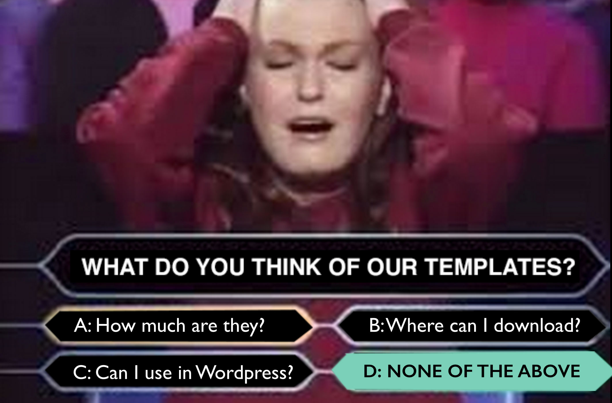
Wuuuuut?! They exist inside the Unbounce product. You can’t buy them, you can’t download them, and you certainly can’t use them with Wordpress!
Epic fail followed by big opportunity.
Clearly visitors (a large portion of whom were arriving via organic search), were getting an entirely incorrect impression from this page. They didn’t understand the context within which you can use the templates.
How do you fix a broken experience like this?
First, let’s take a look at the original page:

Templates right?
Sure, but for what? In what? How much what?
When someone arrives on your landing page, the first thing they do is to look around and subconsciously ask for help.
“I know why I came here, but I’m not sure where I am or what this is.”
Your job as a business, is to understand the mindset of your potential customers when they arrive at your landing page, and communicate appropriately.
In this instance, like I said, there are a large number of organic search visitors showing up who have absolutely zero context. They searched for “landing page templates” and are thinking about templates and templates alone – not restrictions of where or how they can be used.
To answer the questions of these visitors, we created a two-step diagram to illustrate context of use:

The context of use we designed for this circumstance worked as follows:
- You can view the template library in the app when you choose to build a new landing page.
- When you choose a template, you are taken to the page builder where you can customize and edit it.
Test results
Page A [Control] – No context of use
The conversion rate for people who see the templates page is 2.1%.
Page B [Treatment] – With context of use diagram
The conversion rate of people who saw the new version of the page was 3%, a conversion rate lift of +43%.
EPIC WIN! 43% Conversion Lift in New Account Trial Starts
A really impressive result. But this type of number is thrown around all the time. What does it actually mean to a business? What is the impact on revenue?
Impact on Revenue
To figure out the affect this win had on the business I took into account all of the relevant numbers.
- Additional new trial starts (NTS) per month due to this test — 120
- NTS over 12 months — 1440
- Average lifetime value of a customer — $706
Incremental impact on revenue based on a year of extra acquired customers:
1,440 x $706 = $1,016,640
That’s what happens when you help visitors to understand where they are and how the world works while they are there.
Chapter 3: How to make friends forms and influence people
“I f**#ing hate forms! They ruin everything.” — Denis Suhopoljac
That was the reaction from our art director the last time we designed some landing page templates.
Unfortunately, forms are a landing page staple, and because they represent your conversion goal, your ability to understand their nuances is the key to success.
You should remember this statement:

Friction is the barrier to entry (effort) that your form presents to your visitors. Friction falls into two categories and has one solution:
3.1 Perceived Friction
This is the shock factor of suddenly being faced with a long form. The perception of having to fill out such a long form can be daunting and cause people to change their mind. A solution to this can be to either shorten the form or split your form over more than one page.
3.2 Actual Friction
This is the time and trouble it takes to actually *fill in* the form, and it can cause pretty serious abandonment issues if it’s not considered. Things that can slow down – or cause frustration during – the process of form completion include:
- Too many open-ended questions that people have to think about.
- Dropdown menus that don’t include a viable option for the visitor. An example of this is the commonly asked “What industry is your business in?”. If there isn’t an answer available and you don’t provide a way out (like an “Other industry” option) then frustration can occur.
- Captcha security input fields. This is when you have to read strange looking words or letters and type in what you think they say in order to proceed. Anyone not hate those?
3.3 The solution: reducing friction with conversion lube
You probably thought that was a passing reference. Nope. Conversion lube is whatever you can give to your visitor to ease the transaction.
Method One: Ask the data for help
One approach to improvement is to analyze the results you get and adapt your form accordingly. When looking at your form data, ask yourself:
- Are a high percentage of dropdown results the first option in the list? If so, you should try to make the answers as short and clearly distinguishable as possible. If people can easily/quickly read the option that applies to them without lots of hunting/scrolling, they will be more inclined to select it.
- Are the responses to open-ended questions actually real answers? Or are they nonsense (such as “asdfasdf”) designed to get through the form as quickly as possible? If so, you should make the questions more direct and easier to answer. Examples would be: “Tell us about your biggest marketing problem” (requires a short story as an answer) vs. “What is the biggest barrier to your marketing success?” (which could often be answered in a few words like “Not enough traffic.”).
Method Two: Apply some balance
“The prize” is the incentive you offer up in exchange for personal data. Your goal is to balance the size of the prize with the amount of friction.
There are many incentives for a user to give up their personal information: Digital documents: Ebook/whitepaper/report, webinars, newsletters, consultations for professional services, discount coupons, contest entries, free trials, product launch notifications.
The rule here is: Don’t be greedy.
Only ask from your visitors what you would be willing to give up if the roles were reversed.
Okay, be a little more greedy than that, but not much.
For instance, if you will be sending an automated newsletter to registrants, email or email/name are all that’s needed. Whereas if you have a product/service that requires a follow-up sales call, you would want more information to qualify the level of interest, and sometimes extra friction can actually help to remove the looky loos from your funnel and improve lead quality. Like I said, it’s a balancing act.
When in doubt, don’t get ahead of yourself. Remember that you should always start by asking for a kiss before trying to take it a step farther.
I just got a sad feeling.
I don’t think I’ve done enough to make you fall in love with forms.
You should take a trundle over to this page where it’ll all fall into place.
How to design the ultimate lead gen form
Now we’ve covered some of the theory behind forms, you might be wondering exactly how to go about creating a rockstar form. We can do this by designing our form as if it’s the only thing we’re allowed to put on our page.
Your form consists of the following elements:
- A headline to introduce the reason for the form
- A description with bullets to highlight the benefit and contents of what you’re giving away upon completion
- The form with descriptive form fields (original label names and questions can capture attention)
- A Call-To-Action
- Trust statements or links
- A closing urgency or context-enhancement statement
Below is a sketch of how a form designed using this method might look:

How was that? All loved up on forms? Not yet?
Maybe we need some real examples. Below are some examples of lead gen landing pages (#withforms) that I happen to like.
The short and sweet signup form

The ebook download form

The request a callback form floating over a guy’s crotch

The super-long form with a happy guy at the end

#formlove
Chapter 4: The Mad Men pitch – writing copy that converts
Your words are the first thing people pay attention to when the page loads, and the last thing they read before deciding whether or not they will complete your conversion goal.
You would be a mad man (or woman) not to heed this next piece of advice.

Of course, that’s an exaggeration; you should at least spend 5% of your time writing the body copy of your landing page, but that grandiose statement should at least give you a sense of the relative importance of page elements when it comes to conversion rate optimization. For this reason, I’m going to stick to these two elements (headline and CTA) and try to get you outta here before the bell rings.
Start with your headline
Chances are you’ve had to go for a job interview at some point. Either that, or you’re an entrepreneur begging to be heard by either potential customers or potential investors.
Regardless, the most and ONLY important thing when you start a conversation with someone, is to get your foot in the door.
That’s what your headline does.
If you can write a headline interesting and useful enough to hold someone’s attention, you’ve got your foot in the door of conversion. Now that you’re in the elevator, you have those precious extra seconds to communicate/pitch your idea.
Copywriter Roberta Rosenberg offers this sage piece of advice:
” Your headline has one job and one job only. To get your visitors to continue engaging with your message, increase their desire for what you’re offering, and motivate a Call-To-Action click.
That’s why when it comes to crafting effective landing page headlines, choose clarity over clever.
Clever calls attention to itself at the expense of the message.
Clarity smooths the way to conversion.”
I can verify the part about clarity over clever. Whenever we A/B test email subject lines, the clear version beats the funny or clever one. Stupidly, we still carry on testing them 😉
There’s an art to crafting an effective headline, but there are also some techniques and formulas you can lean on to help you get started.
To be very clear though. These are formulas for the construction of writing, not formulas for success – because there are no formulas for success. If there were, I’d be sitting behind a diamond studded Macbook Pro, eating beef jerky and telling stories about eating beef jerky while being successful…
Point being. Use these constructs to do exactly that. Construct your headline. The success depends entirely on your idea plus your will and enthusiasm.
So back to the writing:
Joanna Wiebe from Copyhackers suggests these headline writing formulas:
The Only Way to [Do Something Desirable] Without [Doing Something Undesirable]
The Only Way to Turn Off the Lights Without Clapping or Getting Out of Bed
[Do Something Hard] in [Period of Time] or [Promise]
Tune Your Piano in 15 Minutes or “Piano Tuner App” Is Free
[Do Something Desirable] Like [an Expert] Without [Something Expected & Undesirable]
Learn to Play Chess Like Bobby Fischer – Without Any of the Crazy!
They’re not going to work for everything, but they will get you thinking.
I often like to write the landing page value proposition as a sequence of 3 headlines split throughout the page, like a classic story arc of beginning, middle, and end.
- The main headline
- The reinforcement statement
- The closing argument
You can construct your story like this:
Statement of uniqueness
Backed up with a supporting statement to establish credibility
Expand on the experience
And explain how you solve a pain point
Close with urgency to encourage a call-to-action click
For example, if you are advertising a luxury resort in Costa Rica (cos like, we all do that right?), your 3 part headlines might read something like this:
The Only Luxury Rainforest Retreat in Costa Rica
Dedicated to preserving our wild jungle paradise
Indulge Your Senses in Our Hot Spring Jungle Spa
Without the crowds and distractions of the large tourist resorts
Escape to Costa Rica for a Luxury Experience in One of the World’s Last Remaining Rainforests
What this does is provide big bold statements for people who are quickly scanning your page.
You can see how it’s broken down in the screenshot below:

And don’t bother asking where the Pura Vida resort is.
I made it up.
You’re welcome.
Now write your call to action (CTA)
As Mr. Draper and I pointed out earlier, your CTA is of prime importance because it represents the final tipping point between the success and failure of your campaign.
To click, or not to click. That is the question.
You can break a CTA down into many factors, such as:
- Description (being explicit about what I’ll get)
- Actionable phrasing (using verbs like ‘get’)
- Possessives (choosing ‘my’ vs. ‘your’)
- Subtext (supporting information)
- Urgency (a reason to act now)
To expand on that. I’ll rattle off a paragraph of words that you should memorize while holding your breath:

Every time you add a button to your landing page you need to write down exactly what will happen when the button is clicked, then write those words on the button. It should be specific and driven by the desire to click it. Add words like ‘Get’ at the start to amplify the fact that you will get something by clicking it. Use ‘my’ instead of ‘your’ to personalize the connection. Tell people how long they have to click the button to encourage them to do it NOW! And provide extra context and detail in subtext either inside the button or as an addendum beneath it.
Here’s an example call-to-action based on these 5 factors:

Breaking the button apart you can see how the components work together in beautiful harmony.
- Description: “Get My Free SaaS Project Management Guide” – Describes what you’ll get by clicking.
- Actionable phrasing: “Get” – Describes that you will receive something.
- Possessives: “My” – Personalizes it.
- Subtext: “A quick 5 minute read with 10 top tips!” – Lends extra benefit to the offer as it’s easily digestible.
- Urgency: “Every day you don’t implement these tips you’re losing productivity and money” – Connects with the pain of your prospect and how the offer will help them more if they get it now.
Okay, I get the structure, now how do I write the CTA copy?
Michael Aagaard from ContentVerve.com recommends asking yourself 2 questions in order to optimize your call-to-action copy:
- What is my prospect’s motivation for clicking this button?
- What is my prospect going to get, when he/she clicks this button?
Genius takeaway number 412:
A call-to-action that conveys the value of your offering and its relevance to your prospect will lead to more conversions.
Whoa there, horsey!! You need to resist the “Let’s just test 10 different CTAs” syndrome. I’ve been there and it’s dangerous. Your CTA is also one of the most sensitive and impactful places to play, both in the positive and negative directions.
So take heed of this next section.
Unexpected CTA conversion killers: the power of negative suggestion

Something I see a lot of (and something I highly recommend) is subtext beneath a button. A little horse whisper to encourage the click. These can range from privacy statements to special offer reinforcements.
However, there is a certain type of statement that you want to avoid at all cost.
I’m talking about the “insert a negative word that I wasn’t even thinking of” type of statement.
Consider this scenario. You’ve filled in a form and are about to click the button, when all of a sudden, your eye sees the word SPAM! Albeit in a well meaning way: “We will never spam you.”
“But I wasn’t thinking about spam until you pointed it out! Now I have ’cause to pause™.’ “
Man, I’m getting good at trademarking awesome terms!
What this does is place a seed of doubt in people’s minds at exactly the wrong time.
In an A/B test performed by Michael Aagaard, the inclusion of the word spam bombed conversion rates by 18.7%.

Another example is shown below where the phrase “No Gimmicks” is written right beneath the CTA.

I don’t think I’ve used the word “gimmick” in a sentence in years. Yet now it’s playing in my head and I’m wondering why I’m having second thoughts.
Removing the word “Gimmicks” resulted in a 25% lift in conversions!

Be careful how you supplement your CTAs, and please, please, please, test any changes to avoid an unexpected dip in conversions. I’ve been there and it sucks trying to figure out why your business is suddenly experiencing a negative reaction to something you can’t explain.
Chapter 5: Design theory in 3 minutes
Remember little Johnny from the intro? Don’t get me wrong, I like unicorns and rainbows as much as the next guy – especially double ones. But they have their place.

When people think that design is just pretty pictures. It twangs my sciatic nerve.

As the bloke who’s seen more landing pages than anyone on the planet, I’ve seen my fair share of design trainwrecks. Designs that are so offensive that for some sadistic reason, I love them more than the good ones.
I love critiquing landing pages because it engages my altruistic side. It’s the design equivalent of puppy rescue or freeing Willies.
Oh, right, I said 3 minutes. Okay, let me give you some Conversion Centered Design theory in 150 seconds. Go.
As I mentioned at the beginning of the post, design is all about attention.
Your ad captures attention, your headline maintains attention, and your page design focuses attention. As such, your goal with design is to draw attention to the most important element(s) on the page.
Read faster dammit!
Principle #1 – Directional cues
There’s no doubting the power of the image below. It’s an iconic example of the power of directional cues. Uncle Sam is not only staring right into your soul, but he’s pointing at you to reinforce the word “YOU”. Or “Me” from a more user-centric perspective.

Here’s another example, this time from the UFC:

And an example from a brick-and-mortar business:

And an example on a landing page (remember why we’re here, Oliver).

As you can see, they leave you in no doubt as to what the purpose of the page is.
The secret is to *combine* design elements so that once you’ve shown people the way via directional cues, the place where you’re pointing also has clarity of communication.
There’s no point in having the president of your chess club invite people over for a game of Monopoly. The carpet doesn’t match the drapes.
Principle #2 – Encapsulation
You can think of encapsulation as creating a window on your landing page where your CTA is the view. It’s most effective when used to highlight a form #formlove!
Check out the landing page below. What stands out? The form. How hard was that? Pretty damn hard if you look at most people’s lead gen pages.
It’s easy. Just wrap it up…

“If you like it then you shoulda put a ring on it” — Beyonce Knowle
Principle #3 – Contrasting colours (Hey, I’m Canadian, we use u’s)
Unless you live in a hole, you’ll have read about a boat load of button colour A/B tests. Red is best, green is for go, orange is inviting. Horse excrement. All of it.
It’s as easy as this: Look for the dominant hue of your page, and pick its complement for your CTA. You can see it applied twice in the previous example, where the form container is in very stark contrast to the page and the button then contrasts with that.
If you need help with contrasting colours, check out this colour wheel from Tiger Color Lab:

Find your dominant hue and look opposite.
The photo below – which I took on the summit of a barren hill during a lightning storm in Yellowstone – illustrates the power of contrast to suck in your vision.

In the interest of bringing Canada and the U.S. even closer together, here’s the word “colour” written as “color”. #borderlove

Principle #4 – White space
Space things out. And because you can use any colour you like, not just white, it’s not as racist a name as it seems. Maybe we should say add gaps. There you go. Gaps.
Look at the photo below:

Your eye is free to wander, floating over the image, until it rests on the subject. The Elk in the lower right corner. And then you go “Ahhhhh.”
In landing page terms, I like the next one for it’s clarity (but it suffers from terrible attention ratio).

Two Columns, a smiley face and lots of gappage. You always need content, but that doesn’t mean you can’t space it out.
And now this:

“You found it!”
Yes I did. By searching for “worst landing page ever.” #truestory
Add some gaps, people.

What I mean by that is that by applying these Conversion Centered Design principles, you are focusing attention on your call-to-action. This makes it easier to spot how strong or weak your CTA copy really is. After all, there’s no point in drawing attention to something that’s inherently lame.
Chapter 6: Please, Internet, I want more conversions

Get this. I’m at a wedding in London in the 70s. I’m 4. My mother turns to the person next to her after noticing I’d wandered away from the table. “I should go grab him!” she says. “Let him play” is the reply.
A moment later, another lady at the table says, “Look at that boy on the stage!” – pointing at a kid standing up there, hands held out in front of him in a bowl shape – “he should be called Oliver.”
“He is!!!” my Mother replies looking horrified.
That actually happened. No word of a lie. I’ll give you my mum’s phone number.
Told you there would be charming anecdotes.
What’s my point? Isn’t it enough that you’re all like “I’m listening to Oliver Twist’s life story!”?
I’ll make it easy for you. You should behave like you are Oliver Twist (me), and ask for something more after every conversion.
When you acquire a lead – when someone fills in your form – the results you can get by asking for more will blow your mind. Or refill your bowl of gruel.
Your marketing doesn’t end with a conversion. Where there is intent there is opportunity.
Post-Conversion Marketing (PCM)
The act of asking for – and getting – more from your leads, is known as post-conversion marketing. It’s the process of continuing the conversation with your new lead on the confirmation page they see after filling out your form.
PCM in action – What should you do?
Imagine this scenario in your head brain.
Dude fills out your form to download an ebook about snowboard designs. You say, “Thanks dude! If you like that ebook about snowboard design, yo Continue reading →


 I’ve had to blank a lot out for privacy reasons, but the point can still be seen: Out of the top 10 routes to the thank-you page,


